BUSINESS INSIGHTS: Logo creation in 10-minutes for non-designers

Creating a professional logo can be a daunting task but with the right tools and process, it doesn’t need to be.
As with most things, the tricky part is getting started. The best way to get started with logo design is by examining existing logos.
BUSINESS INSIGHTS: Best logo colours for your small business
Getting Started with Logo Design
Benchmarks offer insights into the logo designs likely to resonate with your target audience. They also highlight trends that can either be incorporated or avoided to create a logo that stands out.
For example, tech start-up logos are often sleek and minimalistic, using san serif fonts to convey modernity and innovation, while traditional brands might prefer classic serif fonts and color schemes. Understanding these nuances through benchmarking allows designers to craft a logo that both aligns with audience expectations and distinguishes the brand from competitors.
Benchmarking Best-Practice Logos
Benchmarking is the first step in the LogoDek logo creation process. Simply choose 3-6 logos that appeal to you, and our proprietary machine-learning models will craft a logo that aligns with the properties common to your benchmarks.
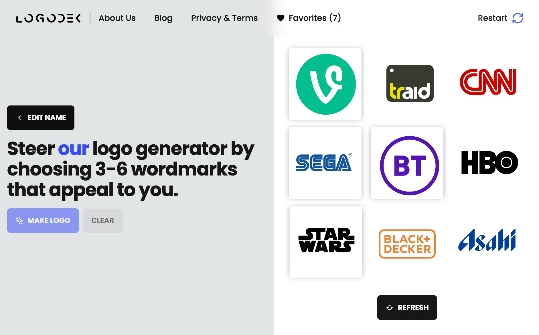
Creative Exploration of Logo Direction
The next step is to determine a design direction. Create a number of options that might work and pick a preferred design route to explore further and finesse.
The LogoDek algorithms generate 20 variations that combine the properties of your selected benchmarks.
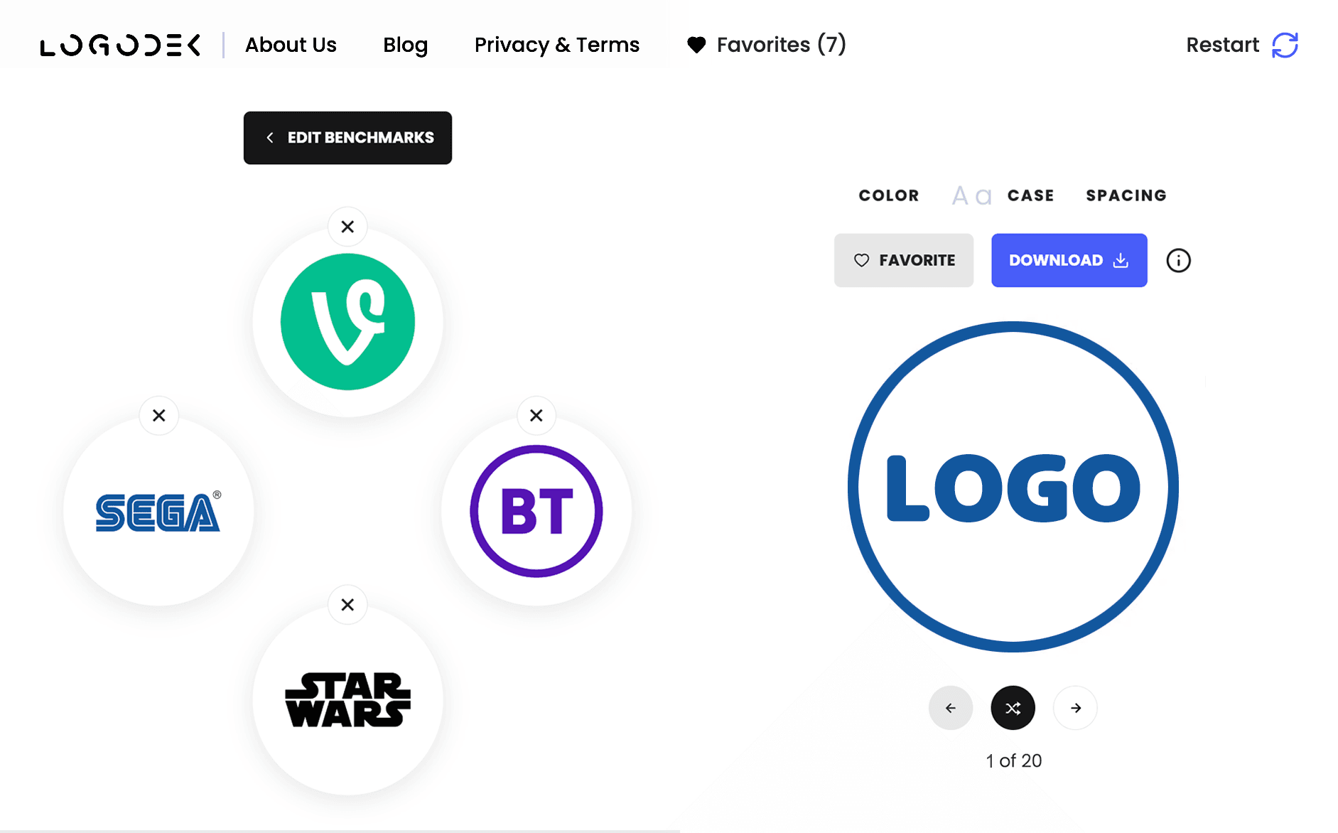
For example, below you can see a LogoDek generated logo prompted by the SEGA color palette, the BT circular keyline, and the STAR WARS heavy san serif upper-case font:
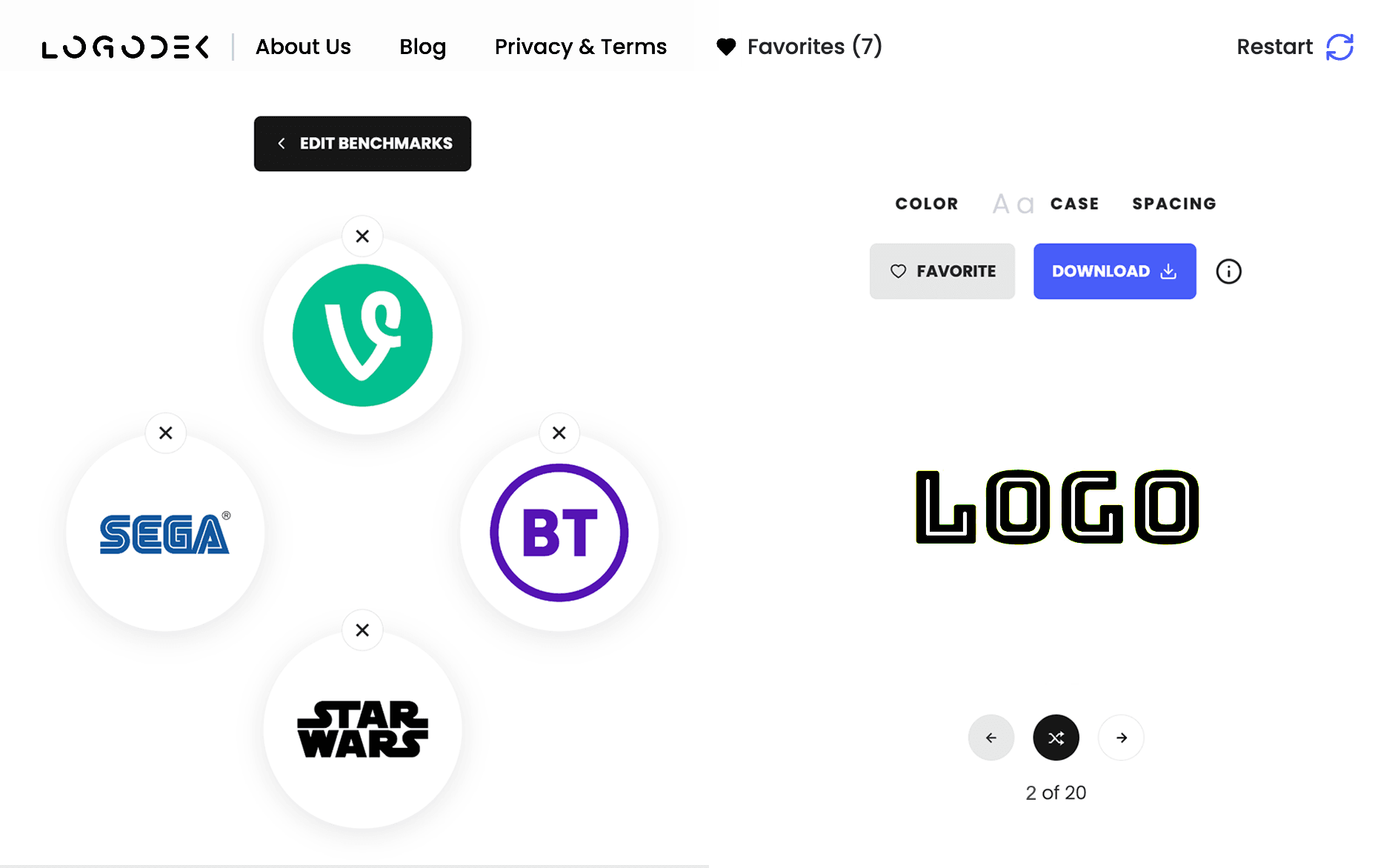
Below, a LogoDek generated logo prompted by the STAR WARS color palette and the SEGA font:
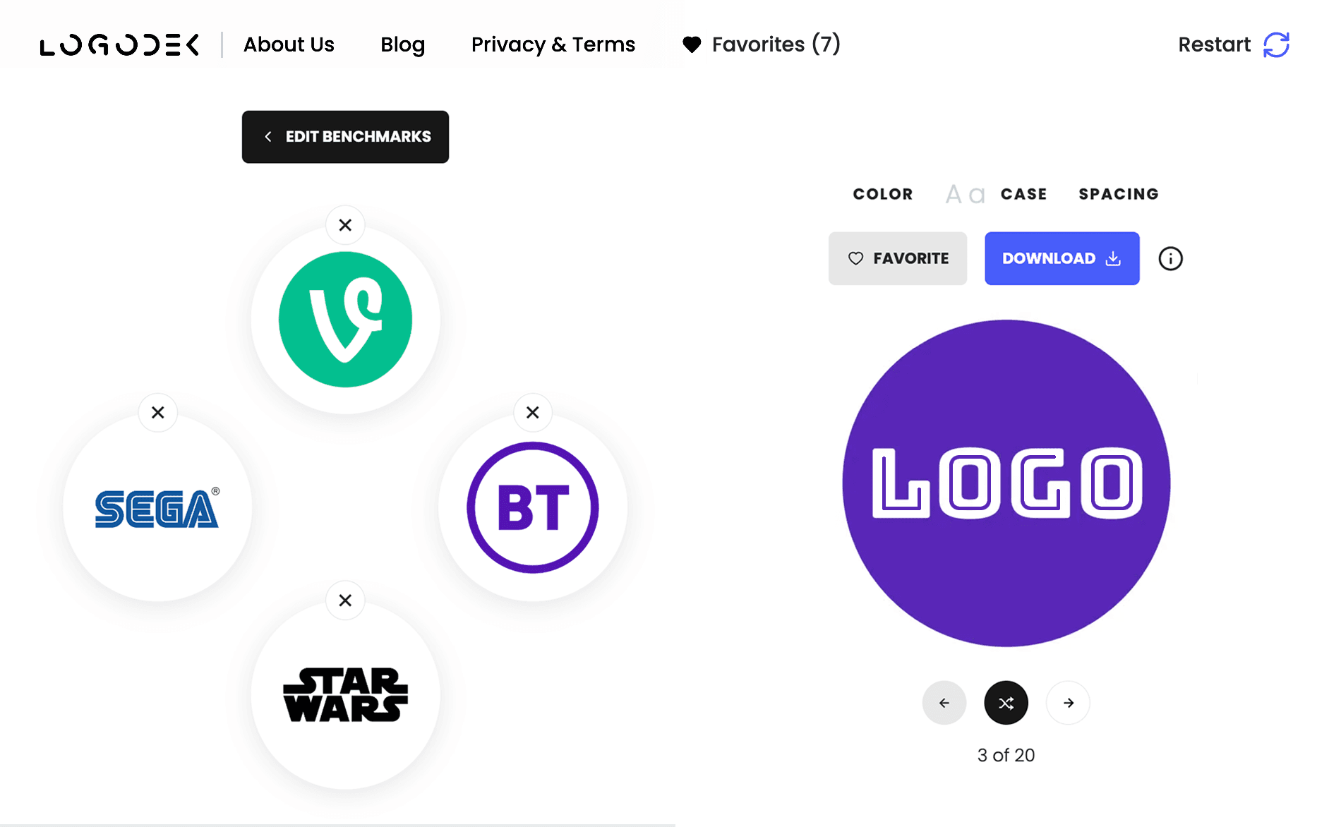
Below, a LogoDek generated logo prompted by the BT color palette, the VINE circular backplate, and the SEGA font:
Below, a LogoDek generated logo prompted by the STAR WARS color palette, the VINE circular backplate, and the VINE and BT letter marks:
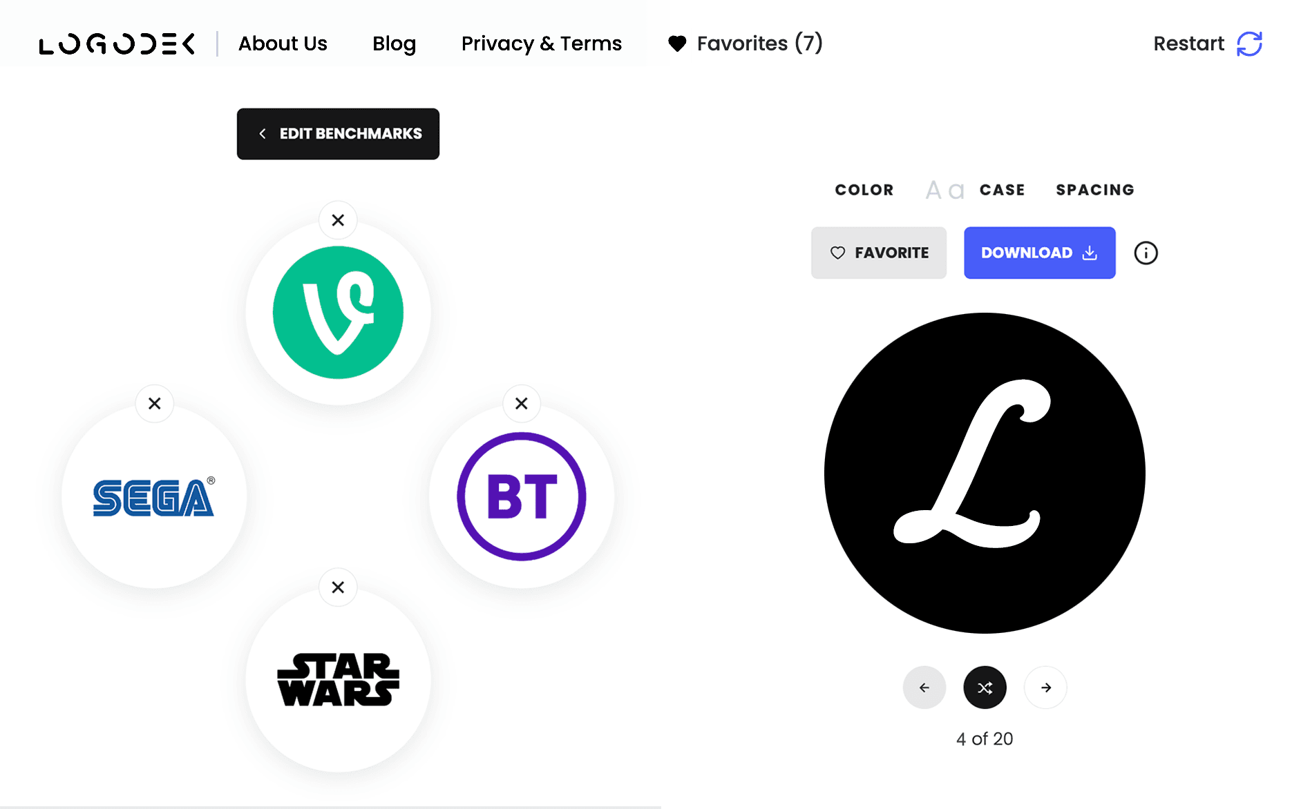
Fine-tuning your Logo
Once you have found a direction you like, you can adjust the underlying properties until you find a combination that works for your brand and audience.
BUSINESS INSIGHTS: The surprising value of free logos
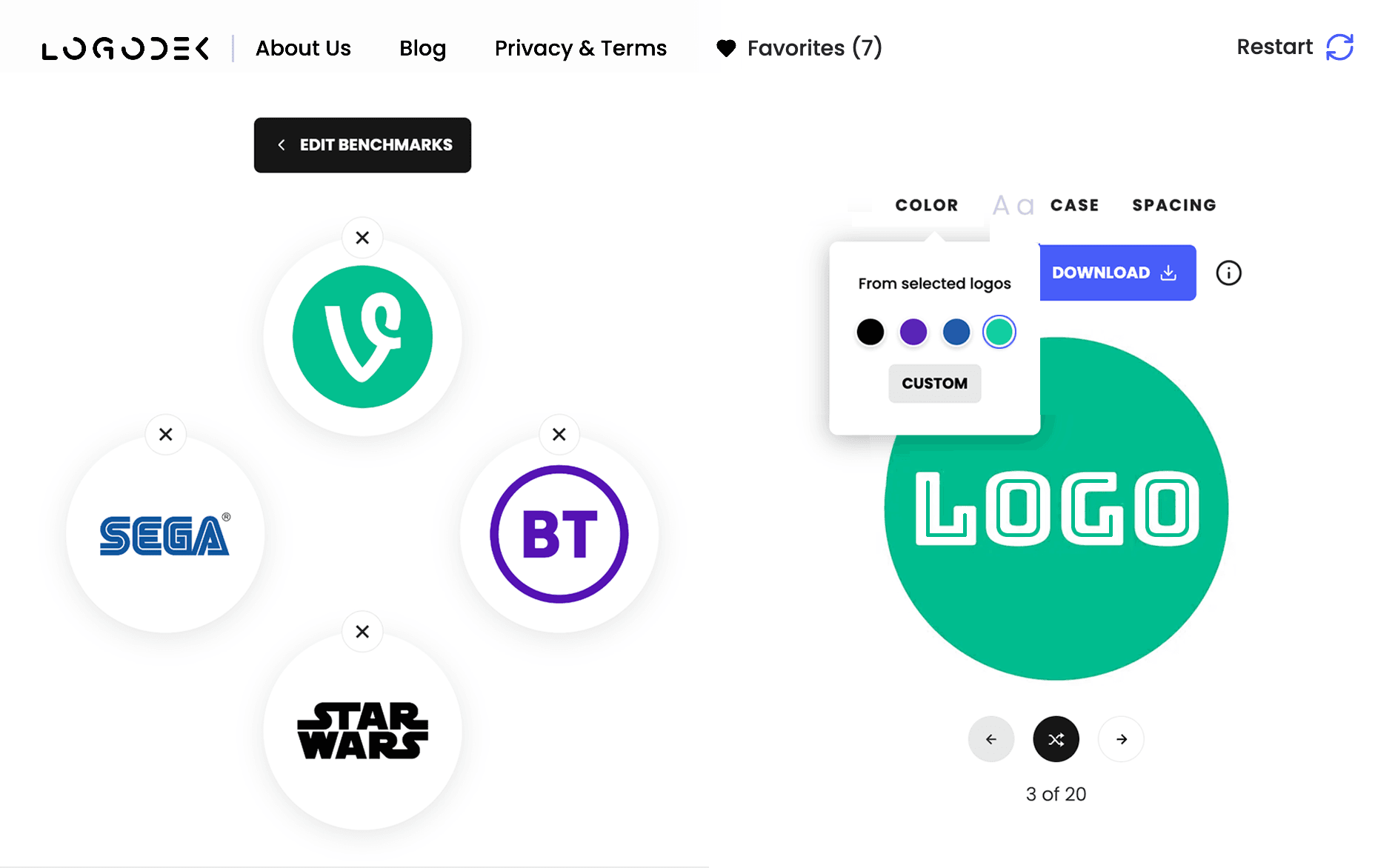
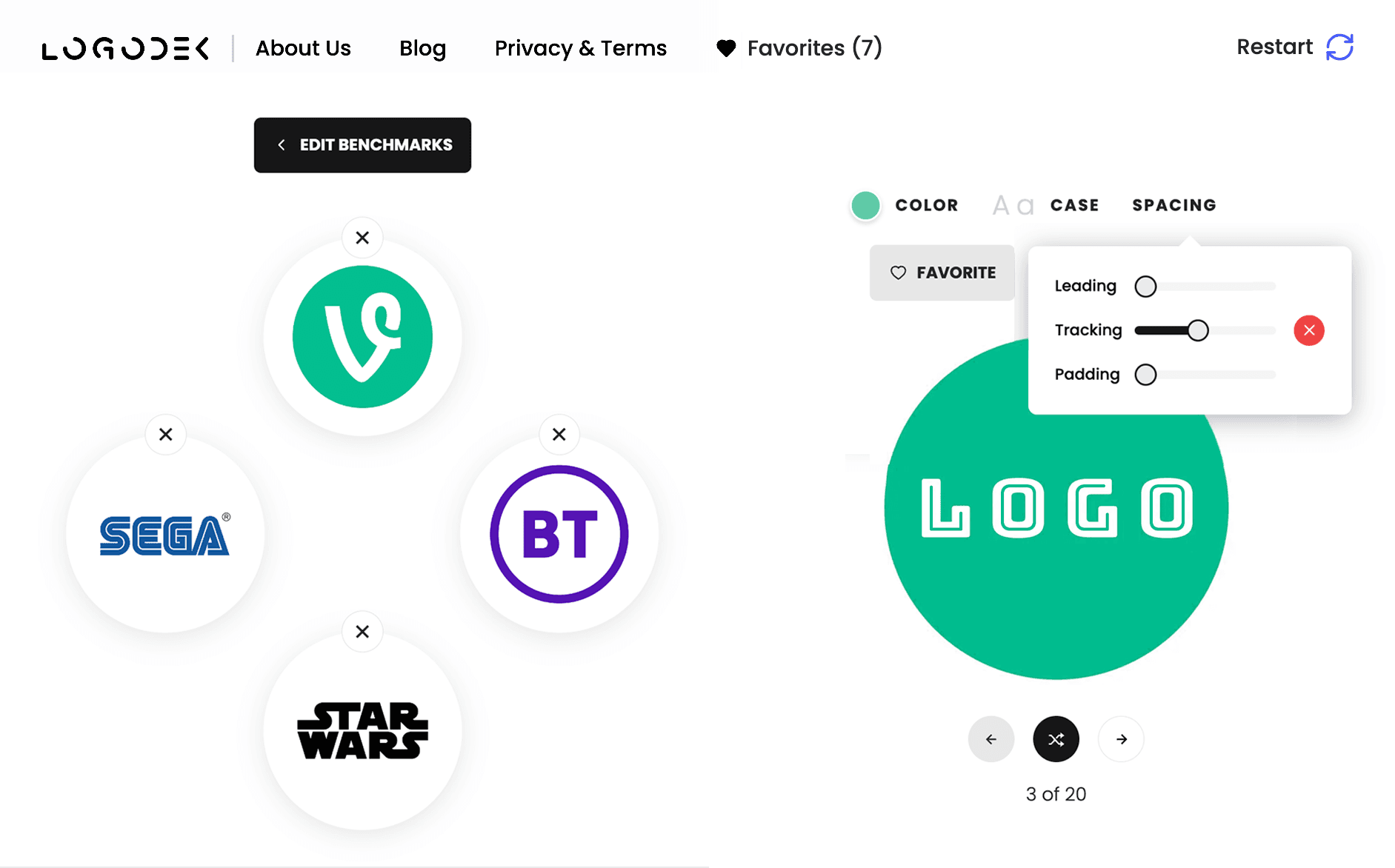
LogoDek makes it easy to fine-tune logos without the need to learn or buy complicated design software. Color, letter case, and spacing can all be adjusted using simple swatches and sliders.
For example, adjusting the color palette of logo 3:
Adjusting the tracking of logo 3:
Conclusion
Benchmarks provide a solid strategic starting point for your logo, offering design direction with minimal effort and guiding the creative process to a clear and effective outcome.
By using benchmarks, start-ups can focus on design choices that align with industry standards, with each choice contributing to a cohesive and professional logo.
This approach reduces time spent on trial and error, resulting in a business-ready professional logo in minutes.
Design a logo in less than 10-minutes yourself with LOGODEK.


